Wednesday, September 15, 2010

Brief History of the typeface design of Georgia


The typeface Georgia was designed for the purpose of screen/web-based print. It was created by Matthew Carter for the Microsoft Corporation. Matthew Carter was born in London in 1937, but resides in Cambridge Massachusetts, United States. During his career, Carter has witness the transition from physical print type to digital type. He worked as a freelance type designer and designed types for Bell Telephone Company. In 1991, he formed his only company called Carter & Cone type foundry with Cherie Cone. He worked mainly on the fonts Georgia and Verdana, which was designed specifically for Apple and Microsoft computers. The typeface was the serif counterpart to the first Microsoft sans serif screen font, Verdana. The font was designed in 1993 but wasn’t released until November 1, 1996 with a font collection based for web productions. It was later coupled up with a font pack released with Internet explorer 4.0. The typeface was designed in the period were clarity for web-based print at low resolution was needed. The designer designed many other known fonts during this period such as Tahoma, Verdana and cascade script. The font was able to accomplish a highly legible font family that had character and charm. The font was influenced by “Scotch Roman” typeface. Matthew Carter has always been fond of the font. “Carter acknowledges the influence of Richard Austin’s early nineteenth-century cut of Scotch Roman on the design of his letterforms” In 2007, Carter updated the typeface for Graphical user interface. Rumors of new versions of Georgia and Verdana typeface families will be released in 2010. This update was due to the emerging market of smart phones, and smart products such as ipads and PDAs. The new version of the fonts will include: • New weights and widths beyond the original four fonts in each family. • Extensions to the character sets • Extensions to the kerning • OpenType typographic features for enhanced typography The typeface won an award at Kyrillitsa in 1999. Carter has won numerous awards for his significant contributions to typography and design. The most recent award would be the 2005 SOTA Typography Award.
Wednesday, September 8, 2010

EBOOK REVIEW

The Adventure of Sherlock Holmes

The Imperial Dread Sea Scrolls

Typography:

1. What typeface is used (serif or san-serif) and is the typography clear and easy to read on a screen?

Serif. The typography is clear and easy to read. The sizing of the letters is large, making it easy to read.

Serif. The typography is clear and easy to read. It is the common font used in novels to make reading easier.

2.How could the designer improve the readability of the text?

The text is large enough, and the type is clear and easy to read. There is not much more you can improve.

The size of the letters could be larger to make reading easier. Its not like we are wasting paper…

Interactivity:

1. What techniques has the designer used to allow you to quickly navigate through the book?

Through the use of clickable contents page that allows you to get straight to the chapter you want. There is also a side bar that has the contents, which is also clickable allowing you to skip and navigate through pages at will. There is also a “go to page” option allowing you to go to the exact page you want.

Through the use of clickable contents page that allows you to get straight to the chapter you want. There is also a side bar that has the contents, which is also clickable allowing you to skip and navigate through pages at will. This sidebar also has the chapter and the topics in each chapter. There is also a “go to page” option allowing you to go to the exact page you want.

2. What further interactive features could be added to make it even more accessible?

A next page/previous page button on each page individual page. A return to content’s page button as well in the middle.

A next page/previous page button on each page individual page. A return to content’s page button as well in the middle.

Wednesday, September 1, 2010

Synopsis and Covers


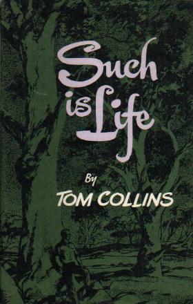
Synopsis - Such is Life, Joeseph Furphy (Tom Collins)

A Collection of diary entries that depict the life of the countryside of australia. The fictional accounts depict the narrators interactions with rural dwellers and itinerant travelers which include chinese and scottish racial interaction.

The book is offensively australian, using australian outback colloquialism and slang. With unforgettable Characters and bush philosophy this book is one of Australia’s most classic novel.


Synopsis - Collected Poems, Banjo Patterson

Banjo's Collected Poems contain well over two hundred pieces of work. These australian based works reflect the author's sense of humor, storytelling flair and intimate knowledge of the bush that he wrote so thoroughly and passionately.
Banjo depicts life in the bush and its hardship and how these hardship can be countered with humour. He also compares the bush life to the big city.